
Explore how xAIcreator's design system creates a cohesive, humanized UI through thoughtful border radius, adaptive menus, and intelligent component patterns.
Introduction
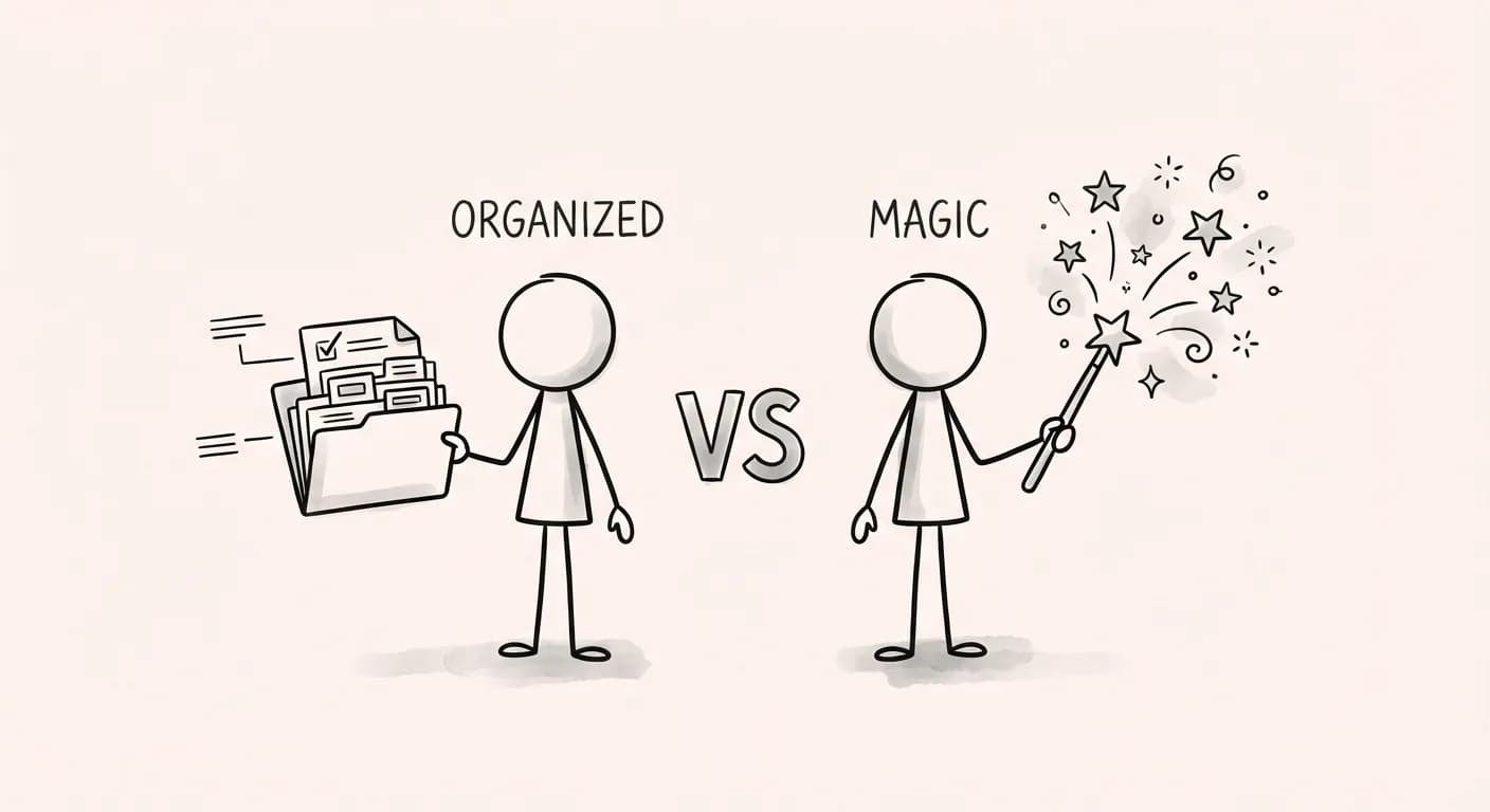
When you interact with a well-designed interface, something feels right. The buttons respond naturally, menus appear exactly where you expect them, and every element seems to belong together. This isn't magic. It's the result of a carefully crafted design system.
At xAIcreator, we've developed a design system built on three principles: visual harmony through layered border radius, adaptive behaviors that respect user context, and humanized interactions that feel natural.
Unlike generic component libraries, our design system is opinionated about the details that matter: border radius relationships, padding distributions, and overflow behaviors that "just work."
The Border Radius Philosophy
Border radius isn't just decoration. It's a visual language. Our system uses three primary radius values that create natural hierarchy:
This creates a visual relationship: containers (18px) hold items (12px), and buttons (pill) stand out as interactive elements. The nested radius ensures inner elements never feel cramped against outer edges.
Radius in Practice: Dropdown Menu
See how the radius values work together in a real component:
 Edit
Edit
 Duplicate
 Archive
 Delete
18px - 6px = 12pxContainer radius minus padding equals item radius
Adaptive Menu Behaviors
Menus that overflow the viewport are frustrating. Our dropdown menus automatically adapt to available space:
max-height: var(--available-height) to never exceed viewport bounds. Long lists become scrollable.
Humanized Interaction Patterns
Small details make interfaces feel thoughtful. Here are patterns that elevate user experience:
Hover Actions
Instead of cluttering the UI with action buttons, we reveal them on hover:
 Professional
 Add style...
Edit and delete buttons appear on hover, keeping the UI clean
Button Variants
Four variants for different levels of emphasis:
Primary
Secondary
 Tertiary
 Ghost
Ghost
Tertiary Button with Custom Colors
The tertiary variant supports custom icon colors with automatic 6% opacity backgrounds:
 Analytics
Published
Delete
Analytics
Published
Delete
Background automatically uses 6% opacity of the icon color
Elevation System
Shadows define visual hierarchy. Our elevation system creates depth through three carefully calibrated levels:
Each elevation level includes a subtle inner highlight (white inset) and a thin border ring for definition. This creates a refined, paper-like quality that feels tactile without being heavy.
elevation-200: Hover transitions for interactive elements
elevation-300: Floating elements that overlay content
Spacing & Padding System
Consistent spacing creates visual rhythm. Our system uses an 8px base grid:
Component Inventory
Our design system includes 20+ components, each following these principles:
Conclusion
A design system is more than components. It's a philosophy encoded in code. The details matter: the relationship between border radius values, how menus adapt to viewport constraints, how actions reveal themselves at the right moment.
These aren't arbitrary decisions. Each choice serves the goal of creating interfaces that feel natural and respectful of user attention.
See It in Action
Visit our interactive documentation to explore every component with live examples and code snippets.
Jay Lee is the lead product designer at XAICreator, bringing a unique blend of design thinking and user experience expertise. He focuses on creating intuitive interfaces that make AI-powered tools accessible to everyone.
With a background in visual design and human-computer interaction, Jay crafts delightful user experiences that balance aesthetics with functionality, helping creators achieve their goals effortlessly.